
REVOLVER MAGAZINE
Magazine Curation
PUBLICATION
Revolver Magazine is designed for the visionary on the go. Those who think for themselves. Those who are always looking towards the future of design. Revolver is made for the sharpest of minds, the boldest of personalities.
Let the visionary in you, shine on...
Masthead Logo • Art Direction• Editorial Layout
LOGO
The masthead logo for Revolver magazine needed to evoke a feeling of futurism and edginess. Sharp angular details and crisp letters were the focal point. The custom typeface logo was developed from the Helvetica font. Chosen for its neutrality, we used this as a base, and then began experimenting with new letter forms, hacking away pieces of each letter, and toying with negative space. Lastly, we experimented with showcasing the logo in a symmetrical manner since the “l” in Revolver provides a point of symmetry for the word.
FOCAL WORDS
EDGY • FUTURISTIC • FRESH • SHARP

FINAL LOGO

MAGAZINE DESIGN & LAYOUT DESIGN
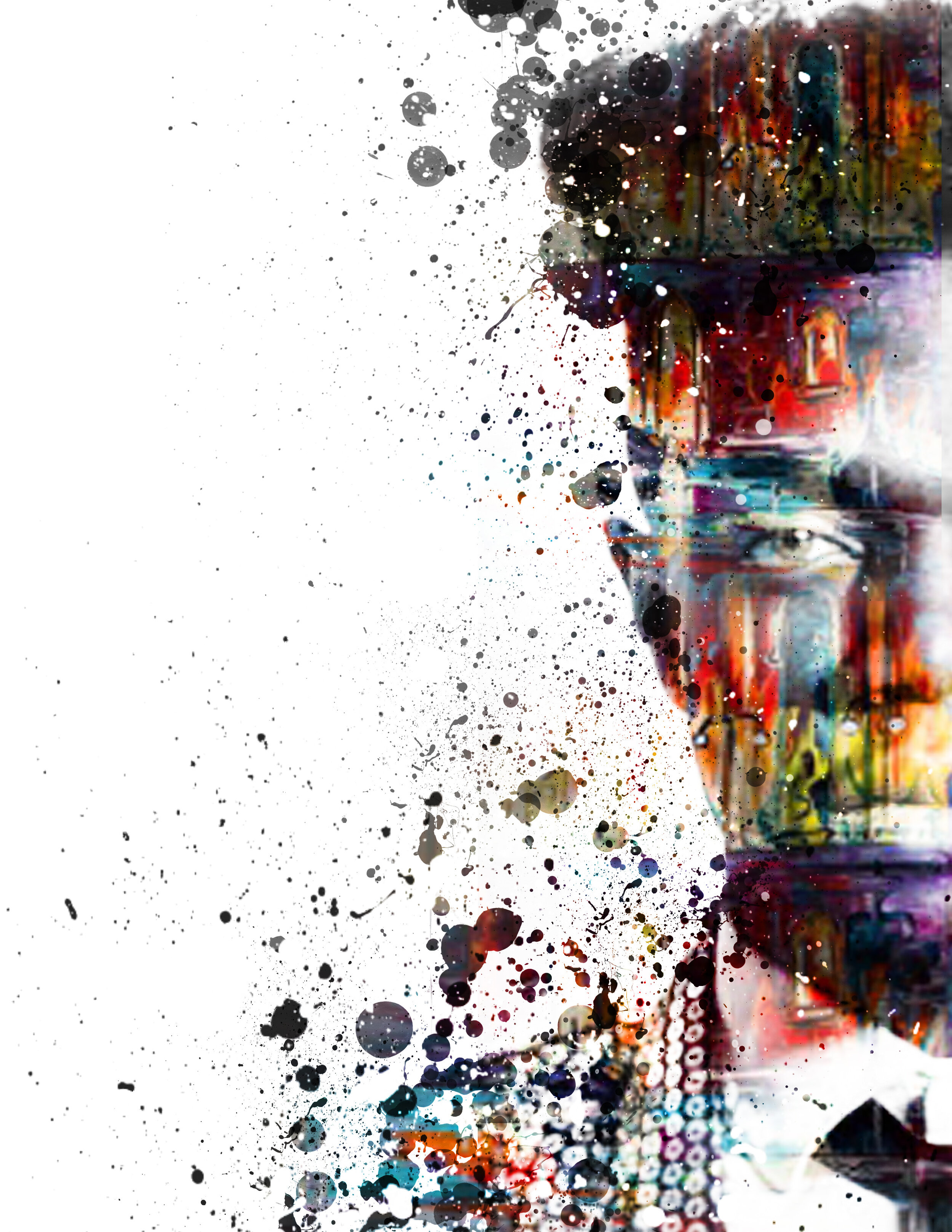
The design of Revolver’s Magazine’s cover is an experimental play with elements of art and paint
combined with elements of minimalism and futurism.

MAGAZINE DESIGN & LAYOUT DESIGN
The design of Revolver’s Magazine’s cover is an experimental play with elements of art and paint
combined with elements of minimalism and futurism.
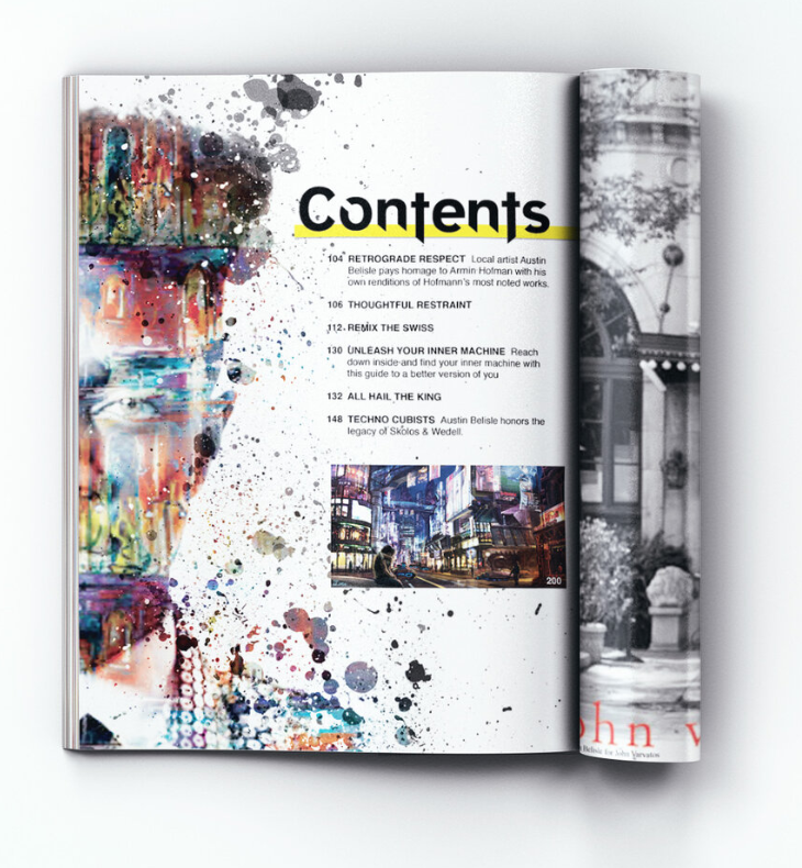
The interior magazine spreads were designed with influence from Armin Hofmann.
All design elements were carefully considered as the goal was to create well balances, consistent, visually appealing spreads.

