

ERIK MILES GROUP
Full Company Rebrand
REAL ESTATE & DEVELOPMENT
Erik Miles is a successful entrepreneur that transitioned from being a licensed real estate attorney to building a real estate team of his own. His vision was to create a new brand that embodied the heart of Los Angeles (specifically, the Hollywood Hills and Sunset area). Since this was a new company, the debut needed to be epic, powerful, and sexy. Erik has always had a love for classic Old School Hollywood (i.e. The Rat Pack, aged photos, lavish nightlife, etc.), so we chose to play with an aesthetic that drew from all of those inspirations. We built everything around a simple black and white color palette and used beautiful, iconic imagery, architectural photos, minimal type, and rose gold accents throughout the collateral to tell a beautiful story of rising wealth.
Logo • Website • Full Collateral Suite • Signage • Creative/Art Direction
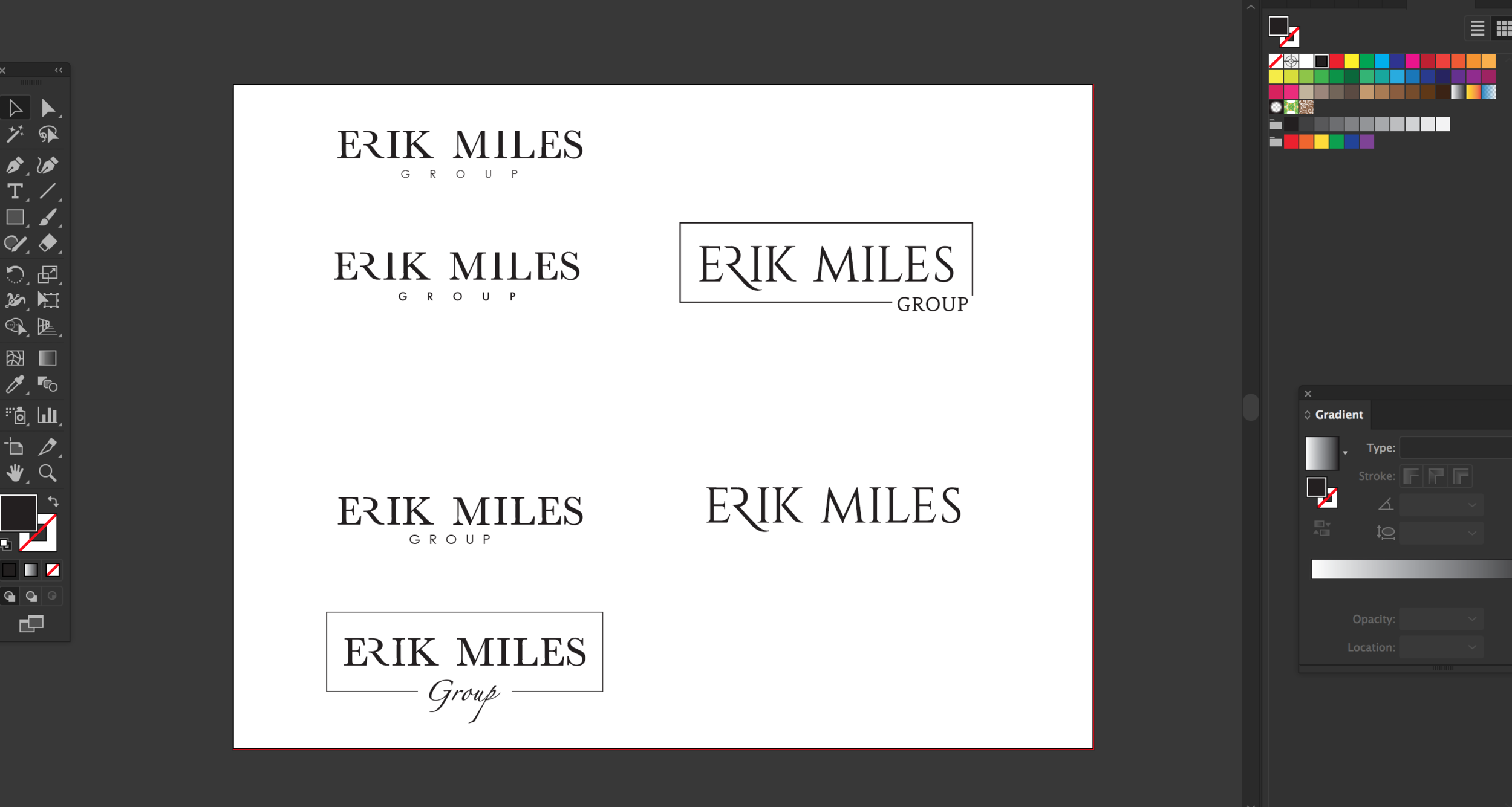
LOGO
With a self-titled company name, EMG (Erik Miles Group), we chose to lead off with a bold but simplistic logo that showcased something modern with a slight nod to old world heritage and wealth. Our solution was to take a font that already had heritage attributes and breathe new life into it through an exploration of letter deconstruction.
FOCAL WORDS: Crisp, Modern, Classic, Heritage

We started with Baskerville for its soft serif details and ability to appear both old and new. For our second study, we chose Cinzel for its decorative qualities. From here, it became an experiment of removing serif details from different letters until we created a flow that felt fresh and new. Ultimately, we went with the Baskerville iteration of the logo. We then decided to give the letter “R’ a little personality with a more rounded and fluid leg. This gave the type a smoother flow and a more refined finish. Lastly, we played with “Group” and how best to treat such a word so short in length. Pairing the logo with the Century Gothic type just felt right.
BEHIND THE SCENES: LOGO PROCESS
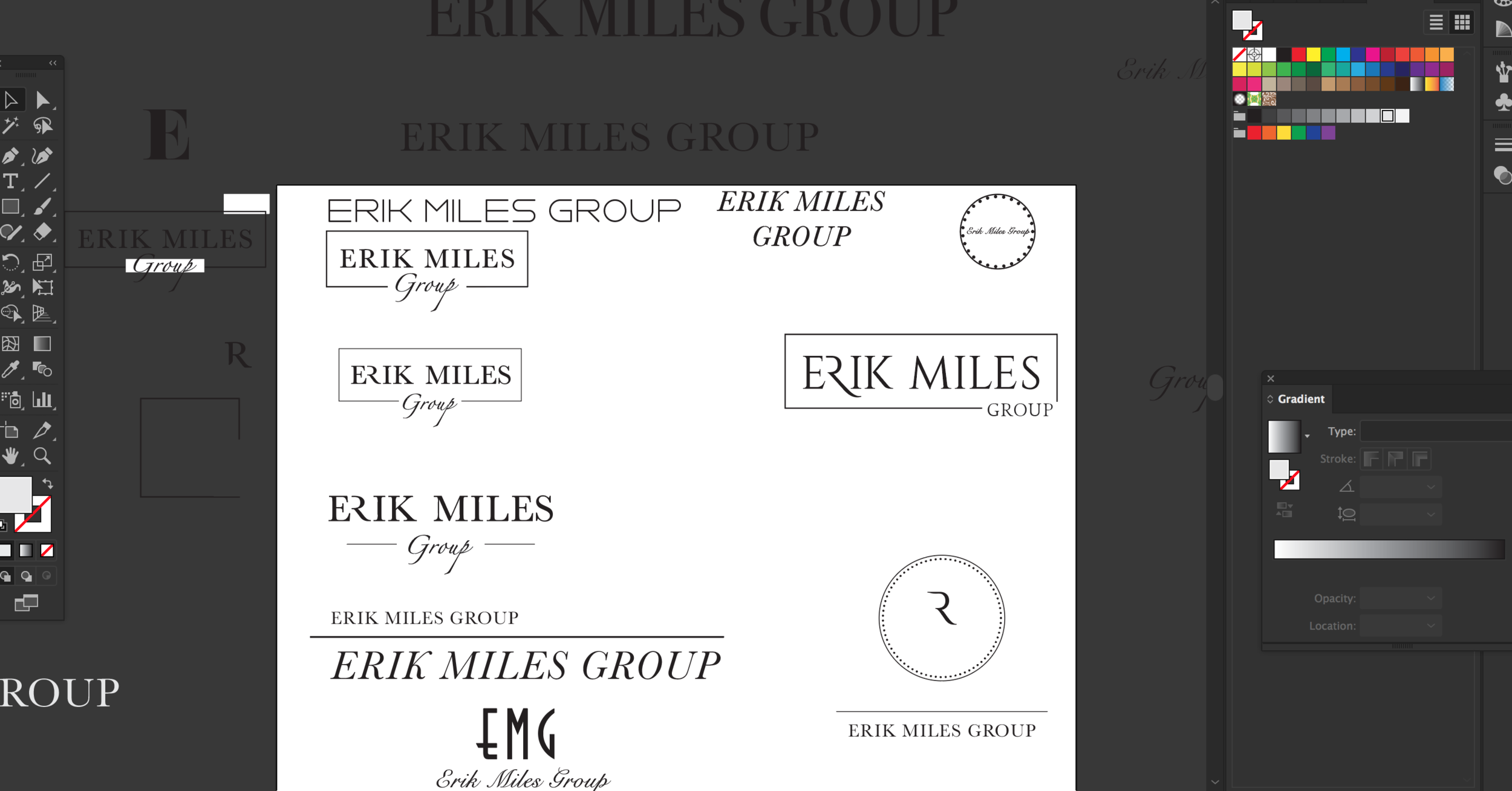
ADDITIONAL LOGO COLOR WAYS


MOODBOARD
The EMG brand needed to take the approach of modern meets heritage. All used photos were to have a sense of perspective and feel life-like. The goal was to convey a classic lifestyle brand instead of just another real estate company. We focused on small details to keep the branding in sync with the black and white palette.


BUSINESS CARDS
We played with the concept of having 2 versions of the business card: one for day time and a darker, sleeker option for night time since Erik attended many Hollywood events at night.


EMAIL SIGNATURES


WEBSITE
The EMG website needed to feel like a moment in time. We used lots of white space and strong, powerful imagery to deliver a true vintage look. The majority of imagery was kept black and white to reference old Hollywood photos of celebrities and high-society patrons. We then brought the site back to modern day with the parallax effect and minimal copy all around the site.


